Project request



XPM360: Modernizing
Construction Project Management
How we transformed a confusing construction platform into a high-converting B2B SaaS website.
Overview
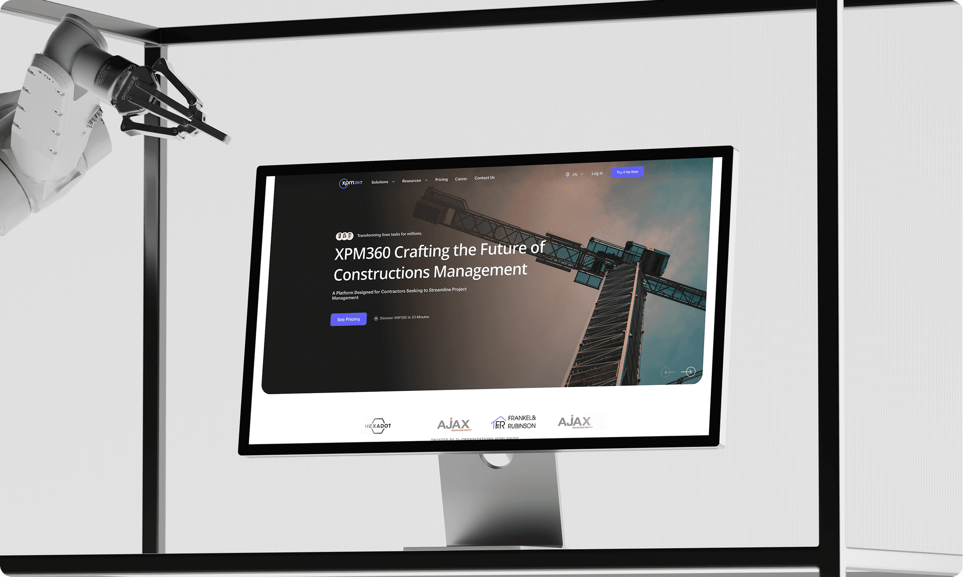
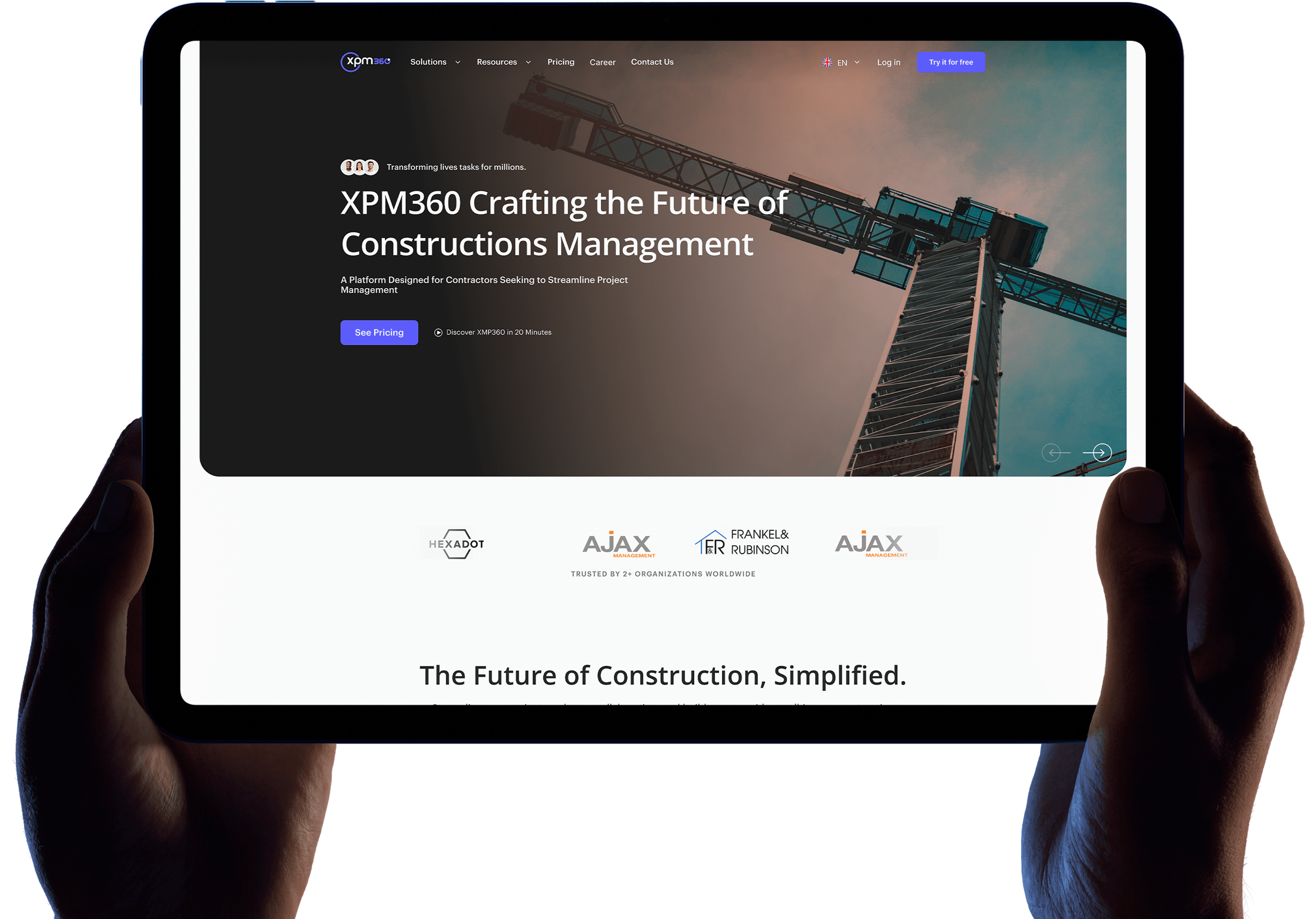
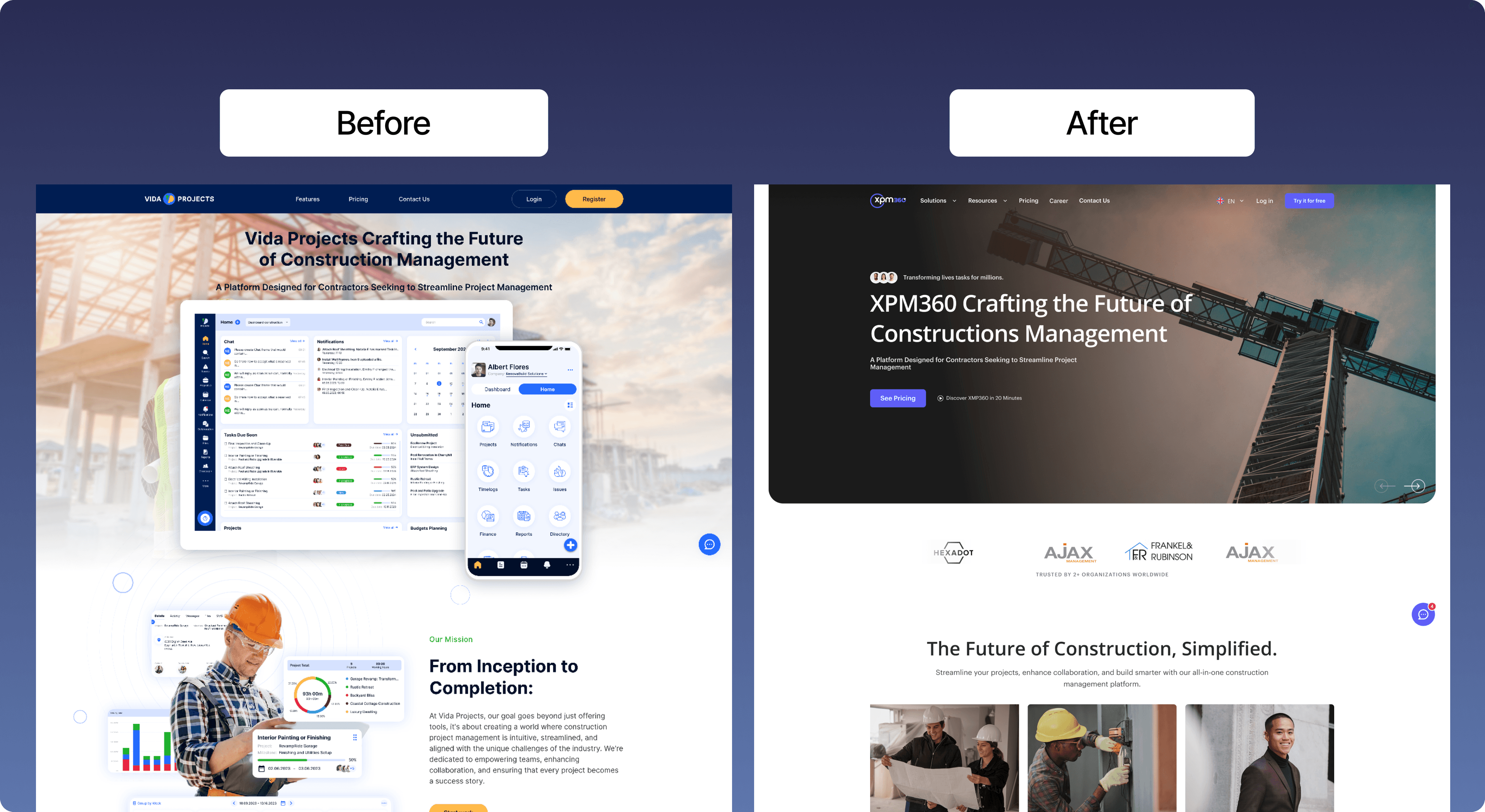
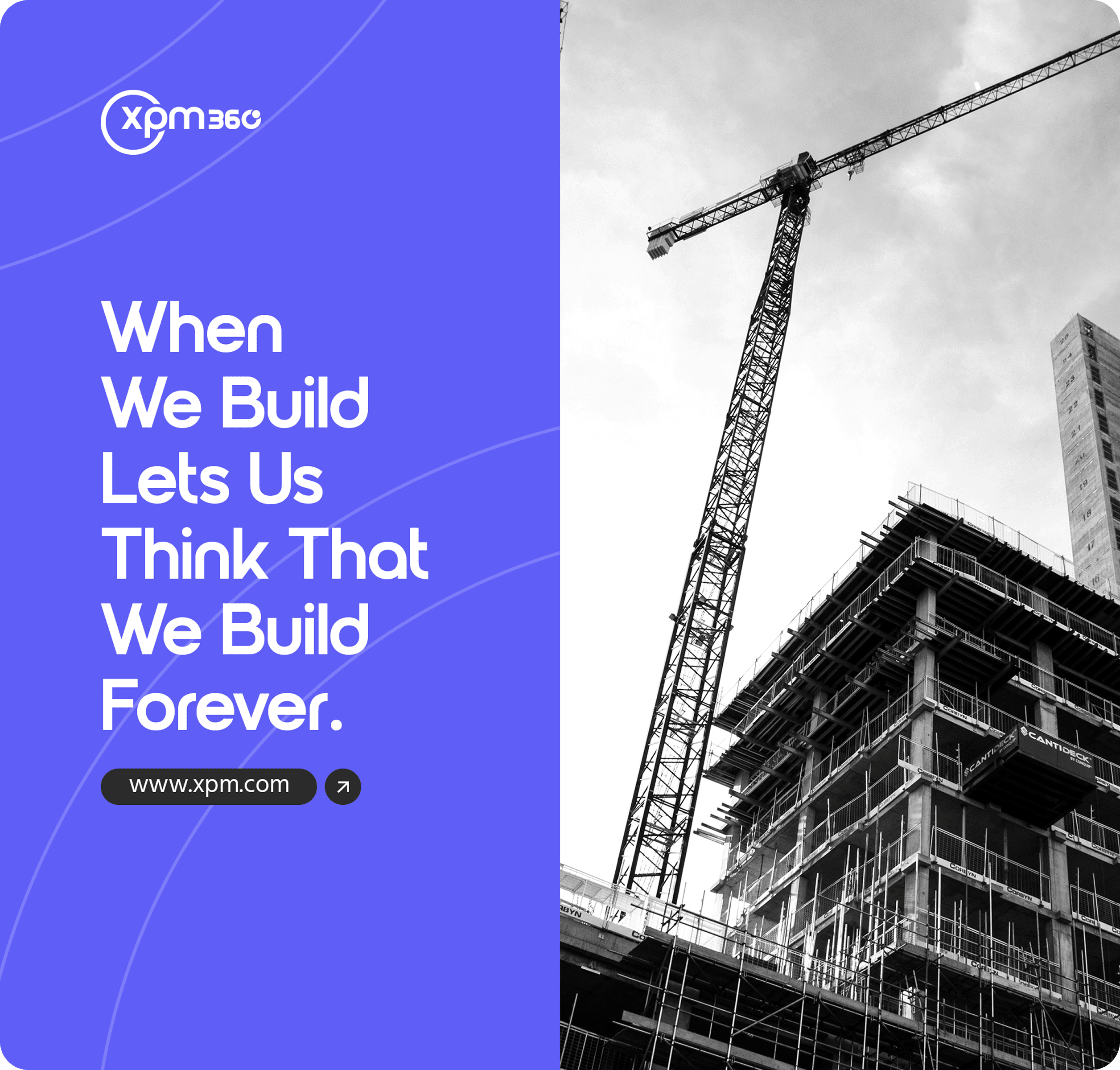
We took a powerful construction management platform hidden behind an ineffective website and completely rebuilt its digital presence. The original site suffered from a fractured layout, visual fatigue, and an identity crisis that forced visitors to do the hard work of figuring out where they fit.
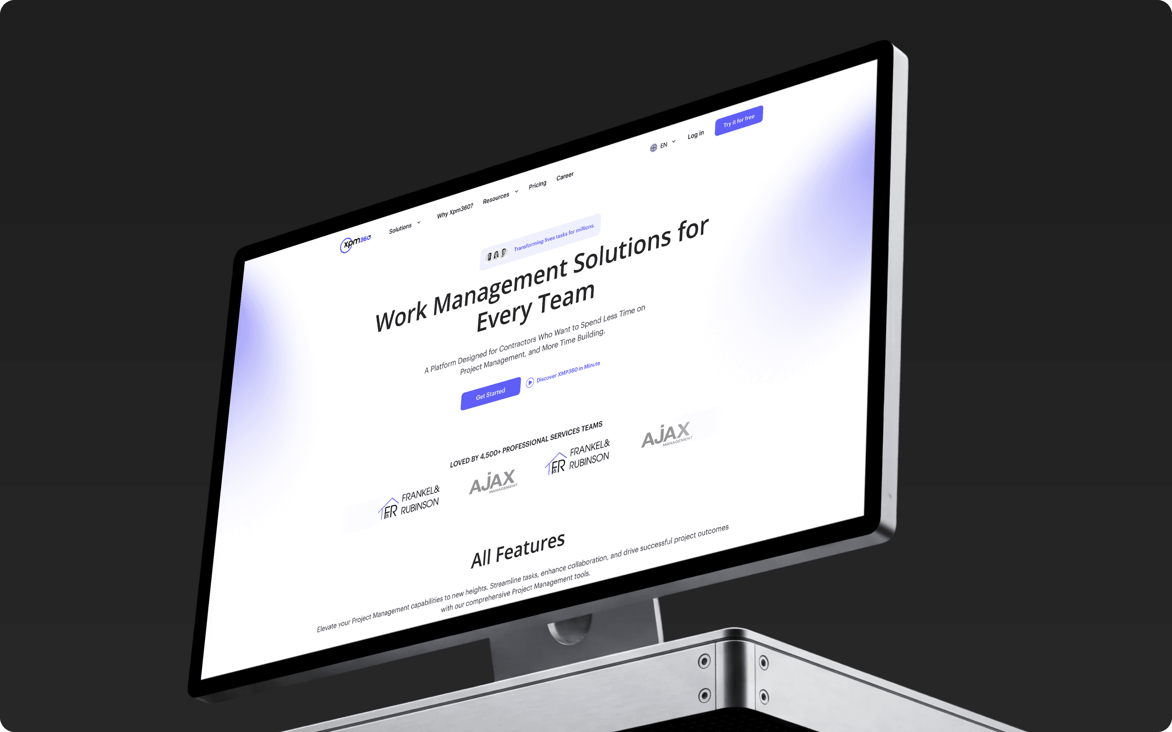
Our team executed an end-to-end redesign—re-architecting the user journey around role-based entry paths, establishing a strict new component system, and delivering a beautifully streamlined 12-page website.
Industry
Service
Technology
Duration
6 Months
Challenge
One pitch for
everyone
The homepage gave the exact same message to general contractors, subcontractors, and property owners. Because it tried to please everyone at once, it didn't connect with anyone.
Features over
value
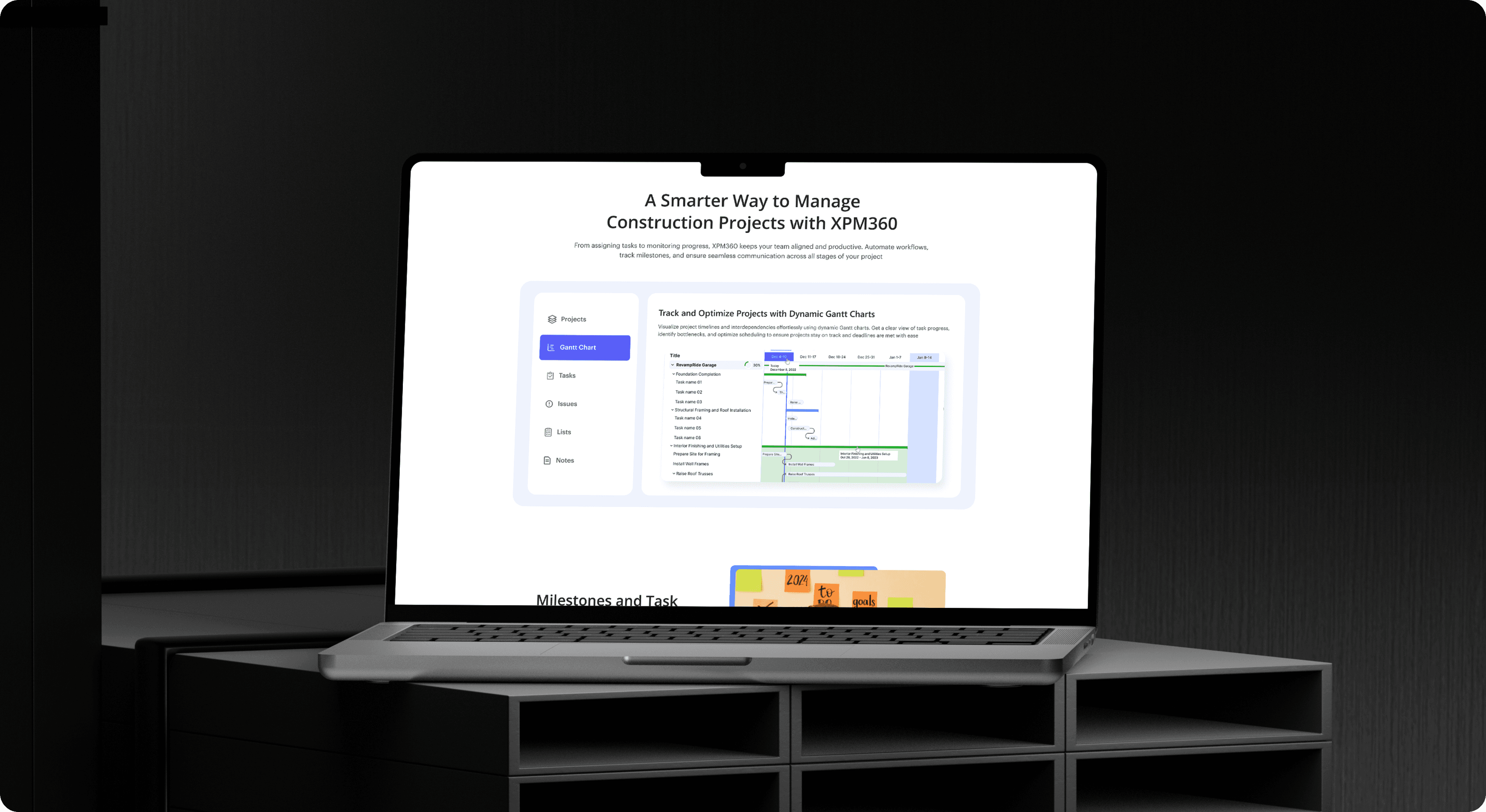
The website showed complicated software screenshots and dense product tours right away. It focused entirely on technical details before explaining how the tool actually makes a builder's life easier.
Visual and layout
chaos
The design kept switching between dark and light background sections, forcing a hard visual reset on every scroll. Combined with five competing accent colors, it created a loud, distracting mess with no clear focus.
The Solution
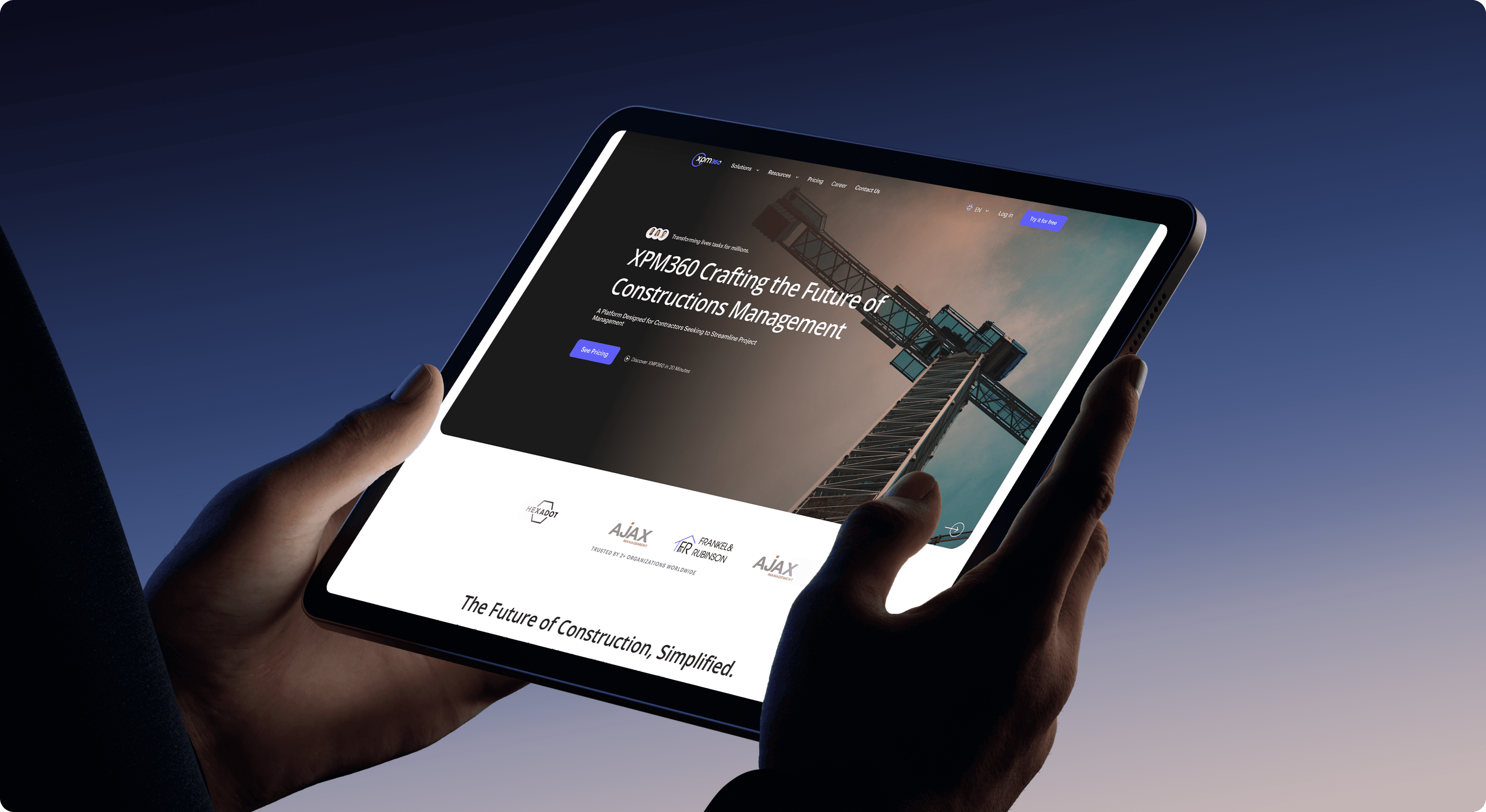
We completely rebuilt the website to make it clean, simple, and easy to use. Instead of forcing visitors to figure out how the platform works, the new design guides them naturally through the page
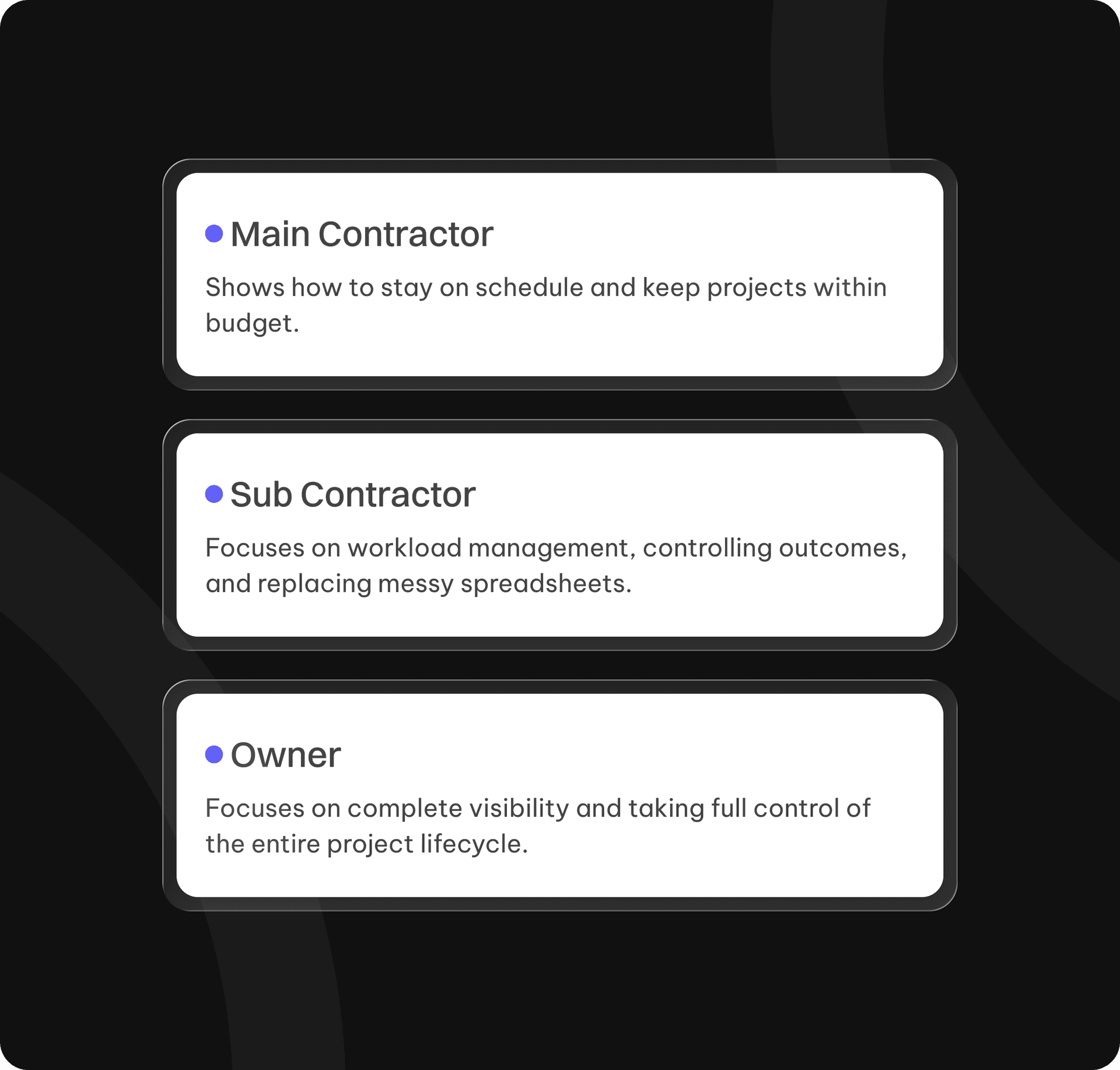
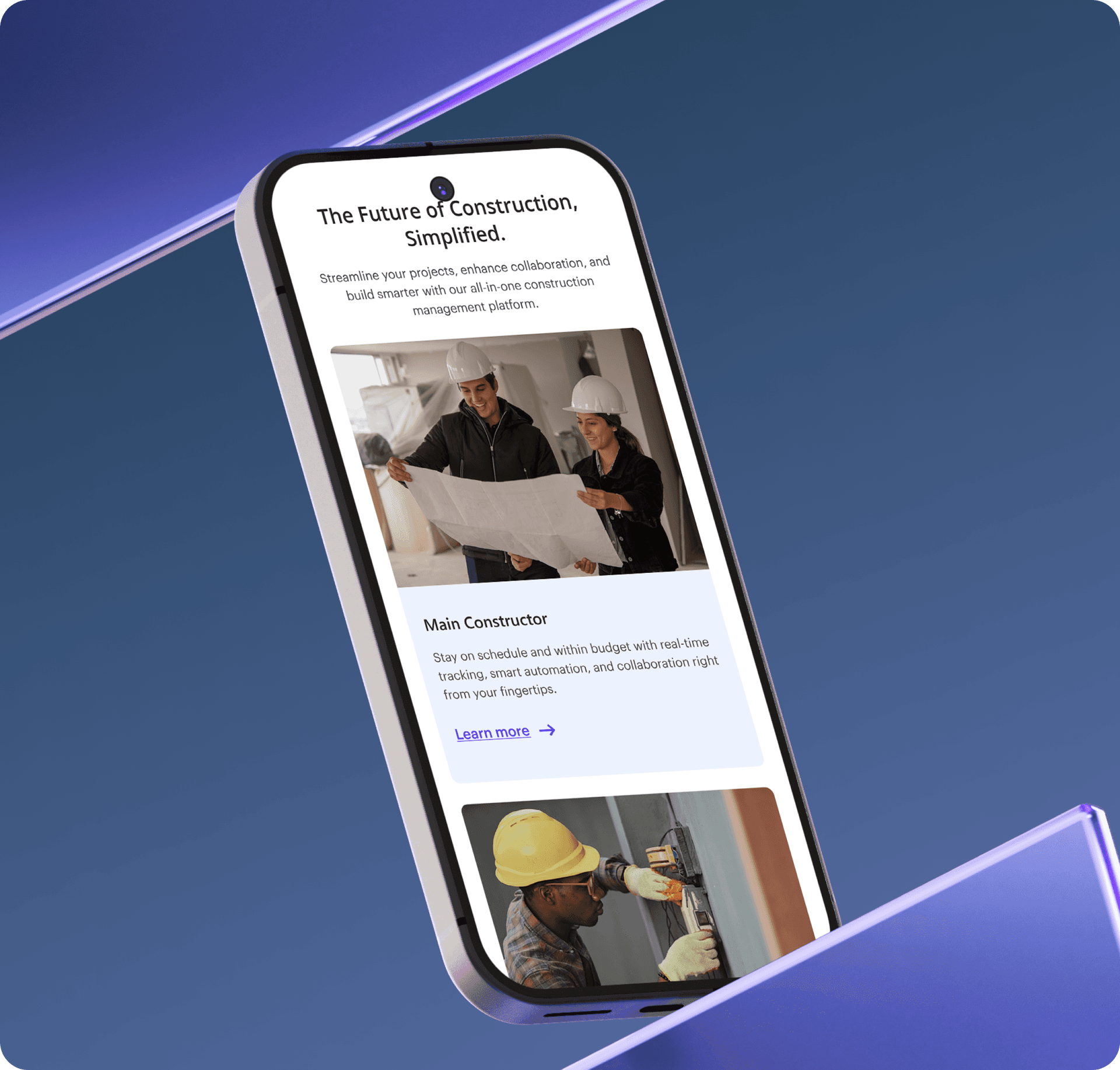
Three Clear Paths for Three Audiences
Instead of mixing everything together, we put three clear options right near the top of the page. Visitors can instantly choose their role to see a pitch tailored just for them:
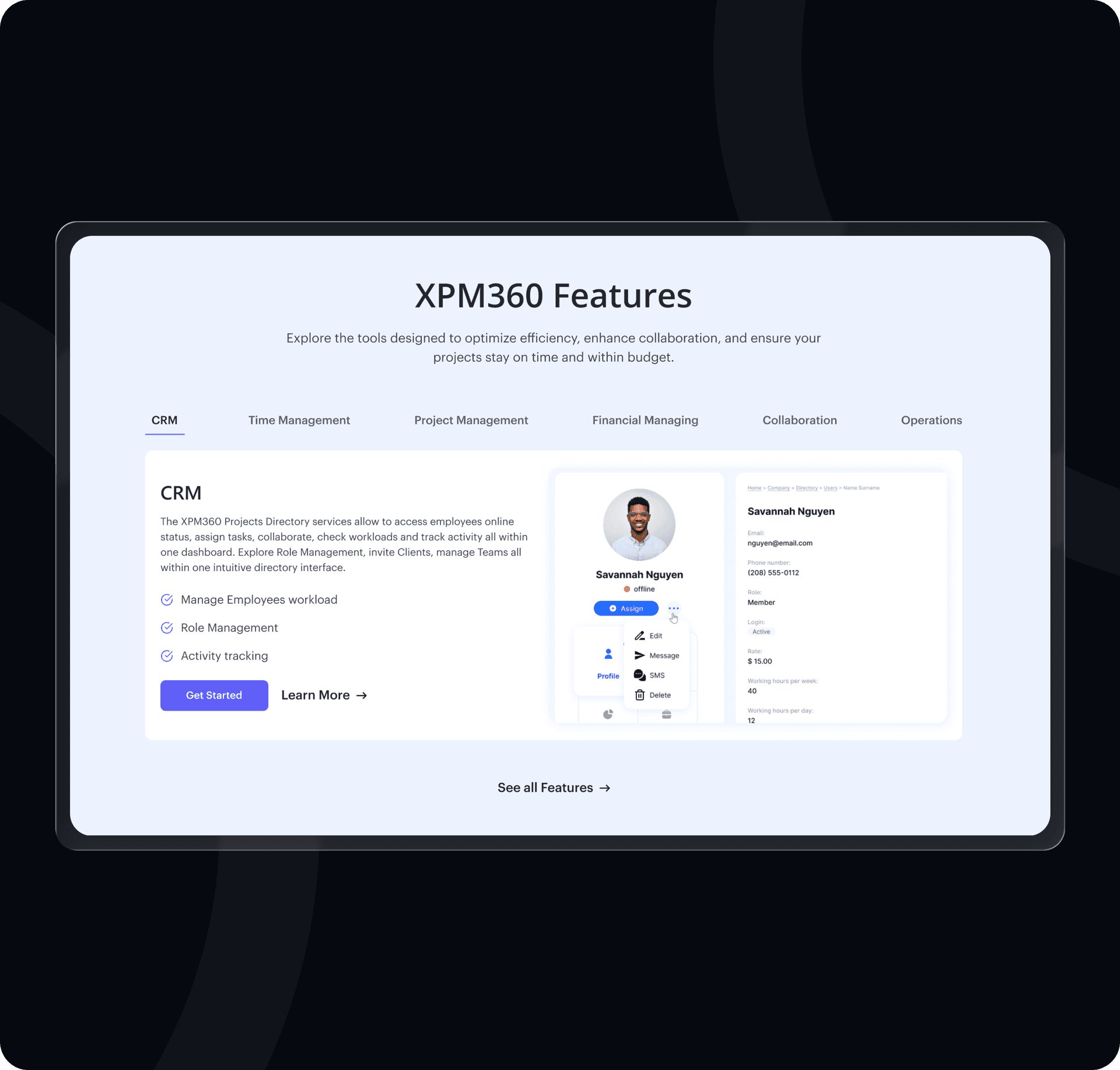
An Easy-to-Read
Feature Guide
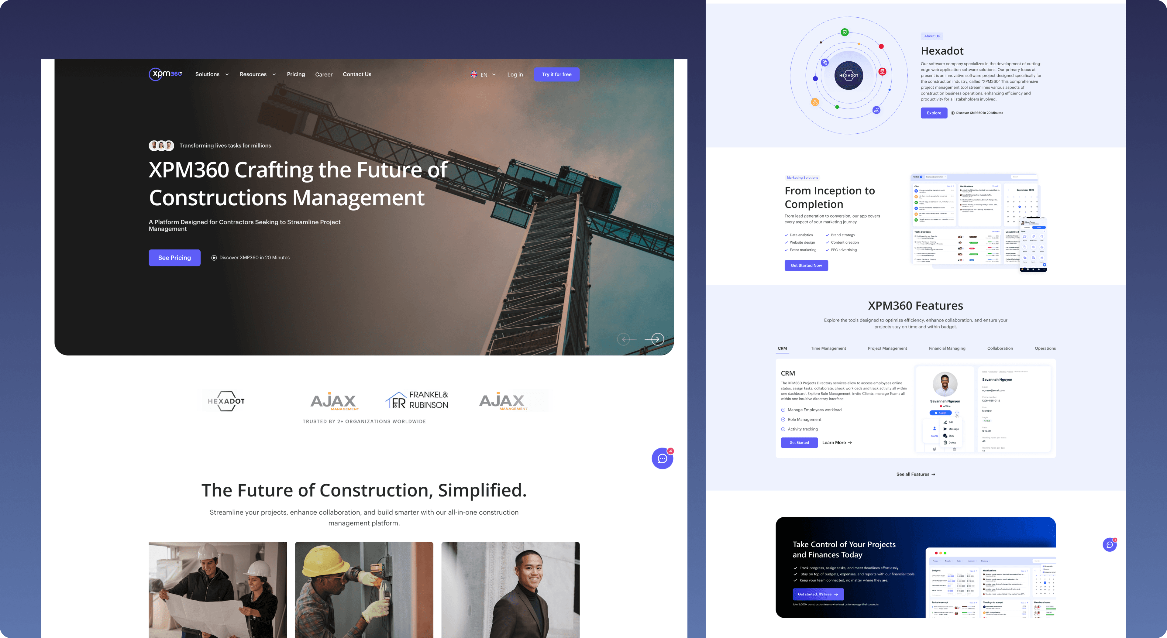
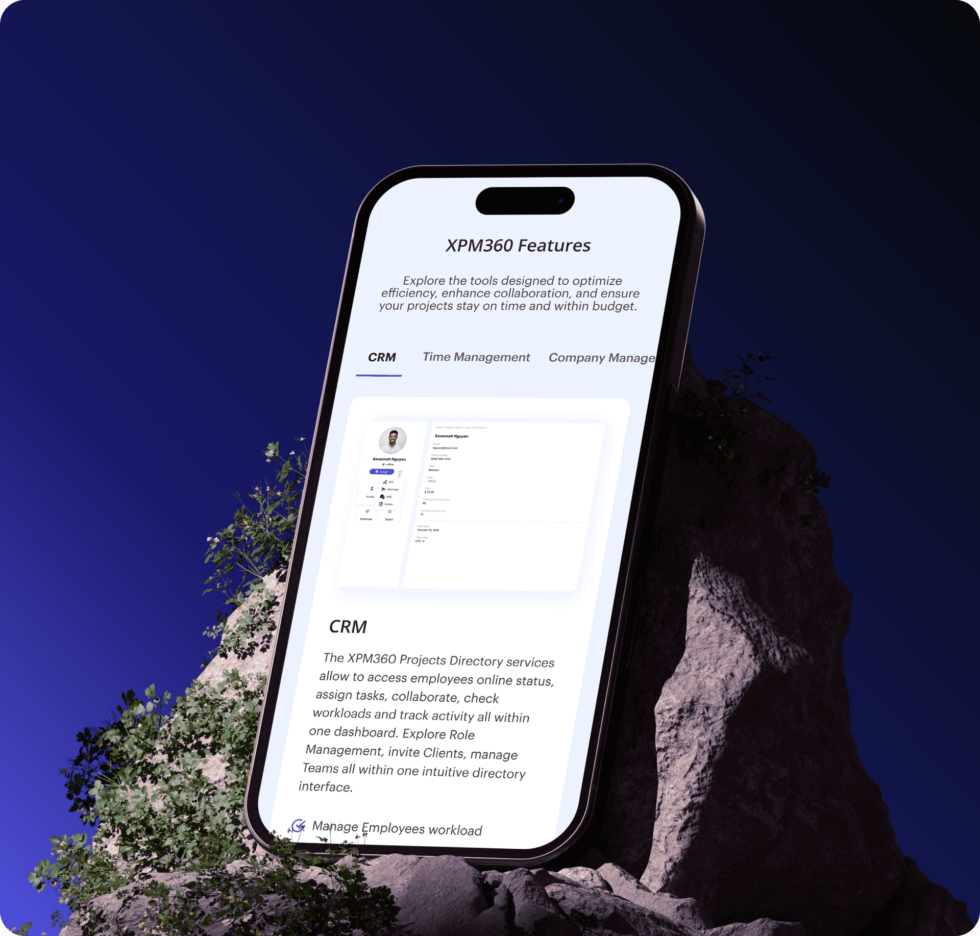
We grouped the software's tools into a clean, simple dashboard section. Visitors can easily click through key features—like CRM, Project Management, and Finances—to see exactly what the tool does without getting overwhelmed by technical clutter.
Smooth Visual Style
We removed all distracting background changes, making the page feel like one smooth, continuous experience. We also cleaned up the colors, using a single modern Indigo-Violet color only for important buttons and actions so visitors always know where to look

Result & Impact
Clear and simple to read
Visitors can now understand what the software does and find their specific role in a single scroll.
Designed to scale
The website uses a clean, reusable layout, making it simple to add new pages in the future without messing up the design.
12 highly optimized pages
Delivered a complete, beautifully organized website focused entirely on readability and user experience.
Fast and simple signup
We removed long, annoying forms and replaced them with a direct button to start a free trial.